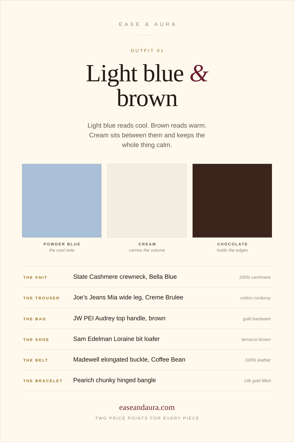
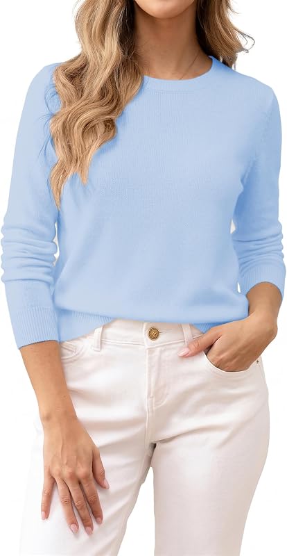
Light blue reads cool, brown reads warm. Cream sits between them and keeps the whole thing calm.
Why it works
Brown is a warm neutral, light blue is a cool one. Neither competes for attention, so the eye reads them as a deliberate pairing rather than an accident.
Cream is what makes it look expensive. Put the blue straight against the brown and it reads busy. Give the volume to cream, keep brown in the bag and the shoe, and the outfit gets a spine.
Keep the value gap wide. Pale washed blue against deep chocolate is what makes it look considered. Mid-blue with mid-brown turns muddy.
Texture does the work colour cannot. Three flat surfaces in three flat colours reads like a uniform. Corduroy underneath, cashmere on top and polished leather at the edges gives the eye somewhere to go without adding a single extra colour.
Seven pieces, two ways each
Fibre and metal read first, price second. Two real options in every slot, every piece checked live.
Brown paired with a different colour each week, with the pieces already chosen and checked.
Disclosure
Ease & Aura earns commission from qualifying purchases made through links on this page, at no additional cost to you. As an Amazon Associate, Ease & Aura earns from qualifying purchases. Pieces are chosen on fibre, construction, size range and cost per wear before anything else.
Every piece checked in stock on 25 September 2026. Prices change; check the listing.